
Monkeys, Hills, and a Lot of Black Ink
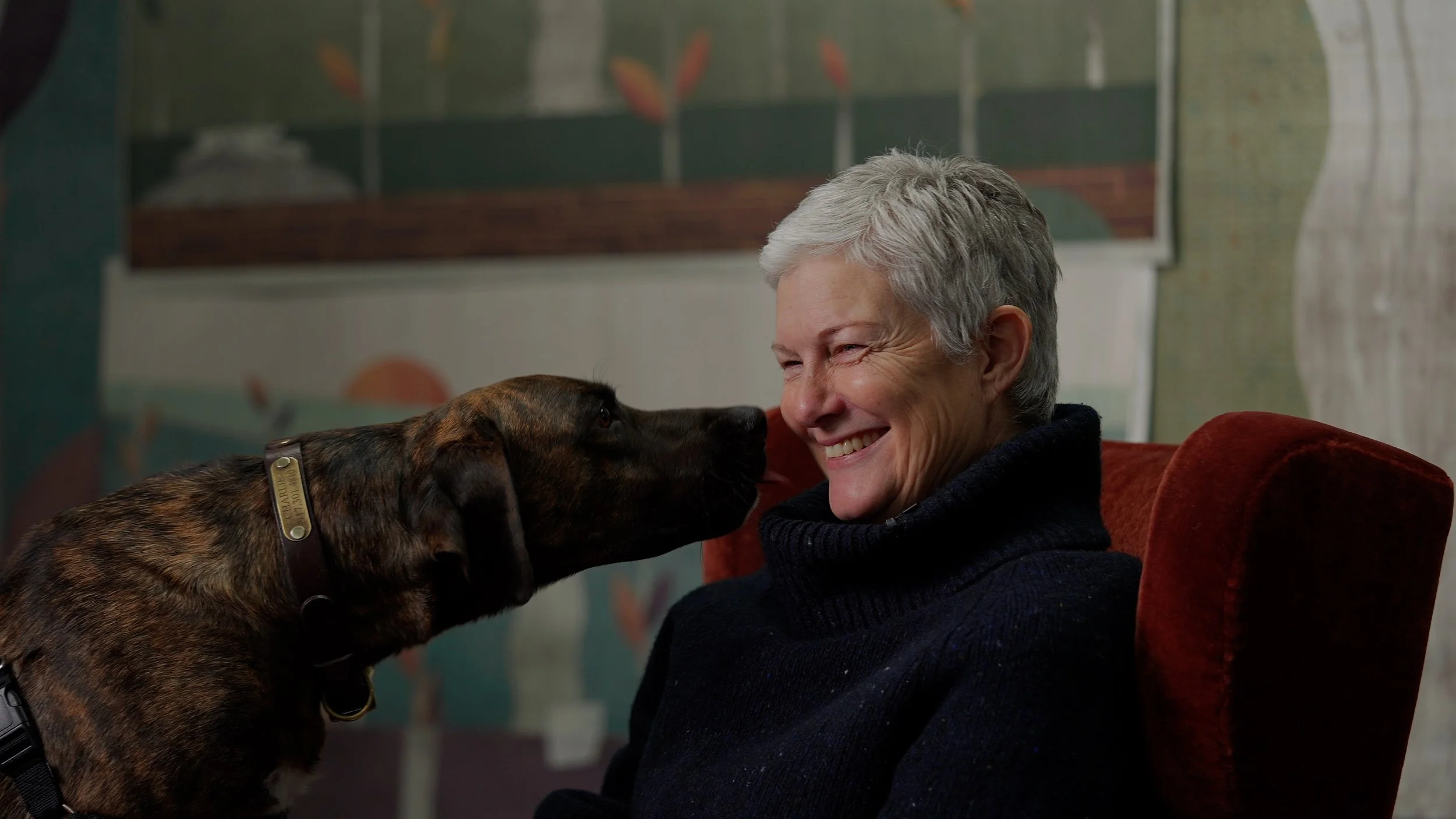
Karen Robert of Aux Abris and color expert Eve Ashcraft on Curious Eve, the Klimt obsession behind it, and what it actually takes to turn a painted hillside into a wall.
There is a moment in any good collaboration when two people stop being polite. For Karen Robert, the founder of Aux Abris, and Eve Ashcraft, the painter and architectural color consultant, that moment came over lunch about three days after they first spoke on the phone.
“I remember saying to her, I could be really coy here, but I really want to do a collection with you,” Karen says. “And that was it. We’re not afraid to say exactly what we think, which is what is important when you’re collaborating.”
The introduction had come from the designer Hadley Wiggins, who has been working closely with Eve and who, when Karen asked if she wanted to do wallpaper, told her she wasn’t ready, but that Eve was. Eve, as it turned out, had also been thinking about wallpaper. She had been deep in a series of intricate painting projects and could feel that the work was already moving in that direction. The two met, traded references, and started the kind of fast, unguarded back-and-forth that produces a collection rather than a committee.

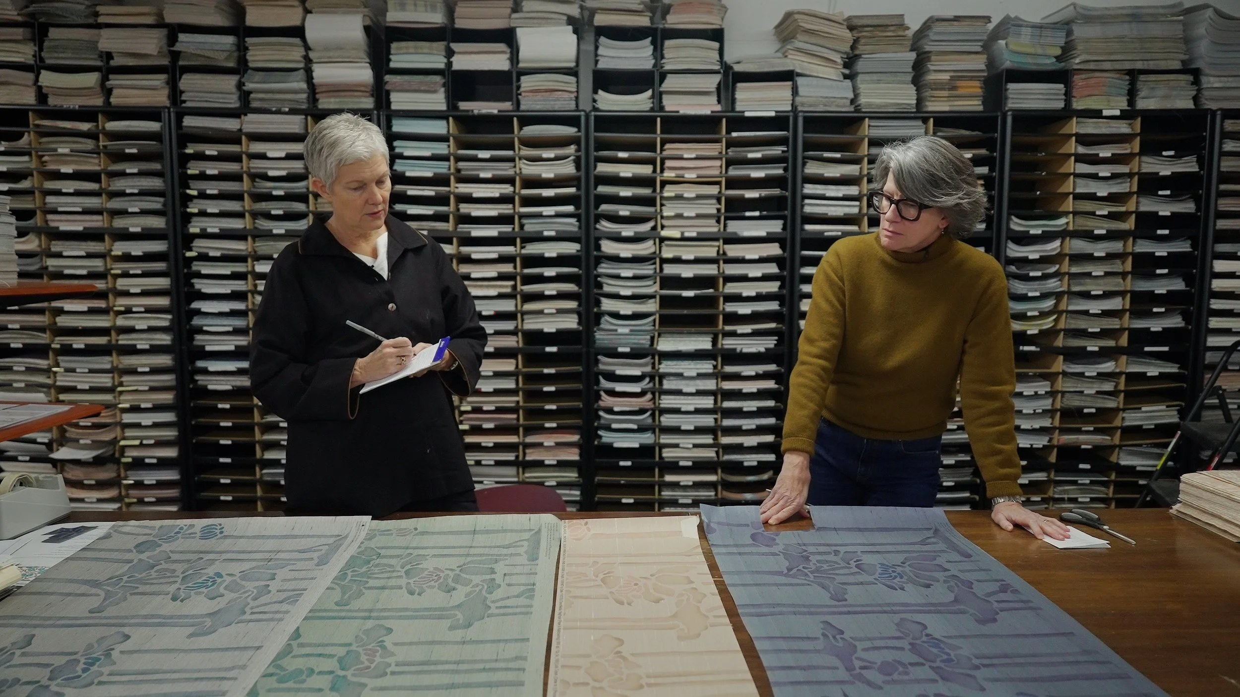
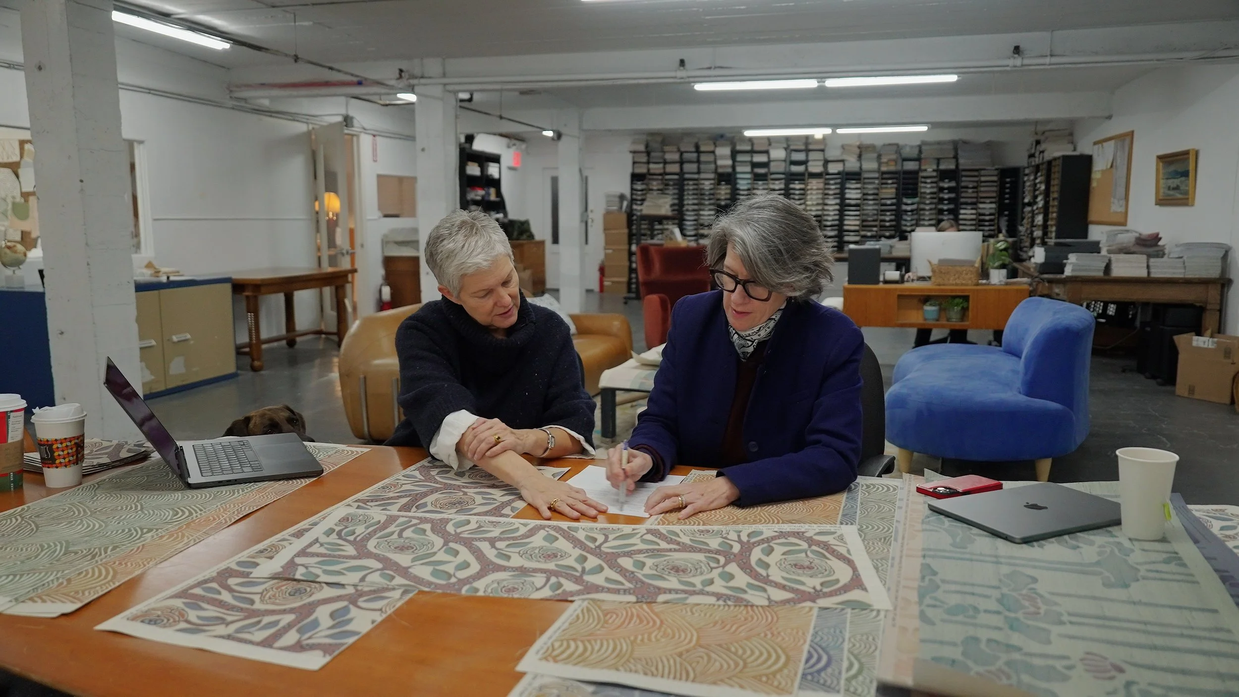
Karen (left) and Eve (right) reviewing color selections for a pattern in the collection.
What they ended up with is Curious Eve, a collection rooted in Art Deco, Viennese Secessionism, the gilded book covers Karen had been pulling, and a fairly serious obsession with Gustav Klimt. There are jewel tones. There are monkeys. And there is one very loose painted hill, repeated, layered, and stretched into a pattern that neither of them quite expected to fall in love with.
The Monkey Mural
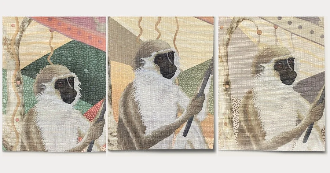
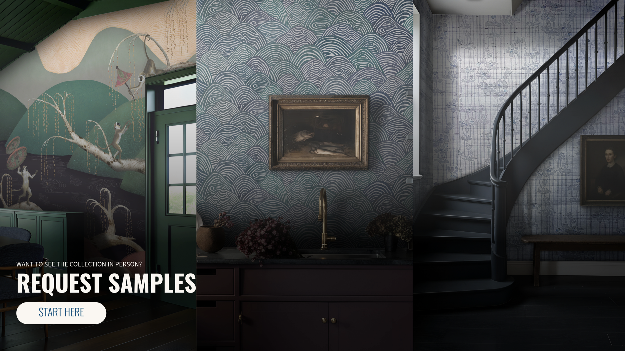
Ask Karen which paper from the collection she expects people to gravitate toward and she lands, without much hesitation, on the monkey mural.
“I’ve had monkeys on my brain for the last year. The more exciting a room, the more exciting images you get. Then other people have exciting ideas, and it sort of builds on itself.”

That building-on-itself quality is, in a sense, the whole logic of the collection. Karen and Eve had originally been pulling on a different thread entirely, one that they followed for some time before deciding it was not working. “Within five minutes, we were like, delete, delete, delete, delete, and then start again,” Karen says. “Neither of us looked back.”
They are clear-eyed about the cost of that kind of editing. “You realize, if you’re going to spend that much time, you really want to make something that you feel great about,” Eve says. “So if it means editing things out, changing direction, you have to sort of get over that and just keep going.”
Analog Ink, Digital Wall
One of the more quietly fascinating things about the collection is how it was actually made. Eve came to the project, by her own description, as a very analog collaborator. She would paint components by hand, photograph them, and send the images to Karen, who would then composite, layer, and manipulate them digitally.
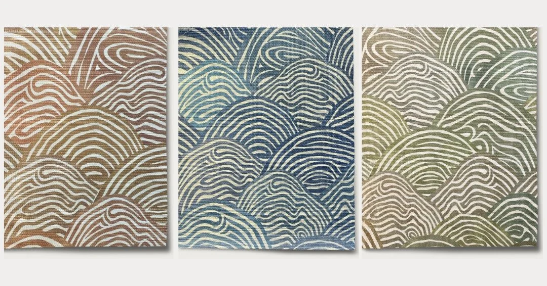
The pattern that became one of the collection’s anchors started life as eight small painted hills, each on a sheet maybe the size of a piece of letter paper, all rendered in black ink on white.
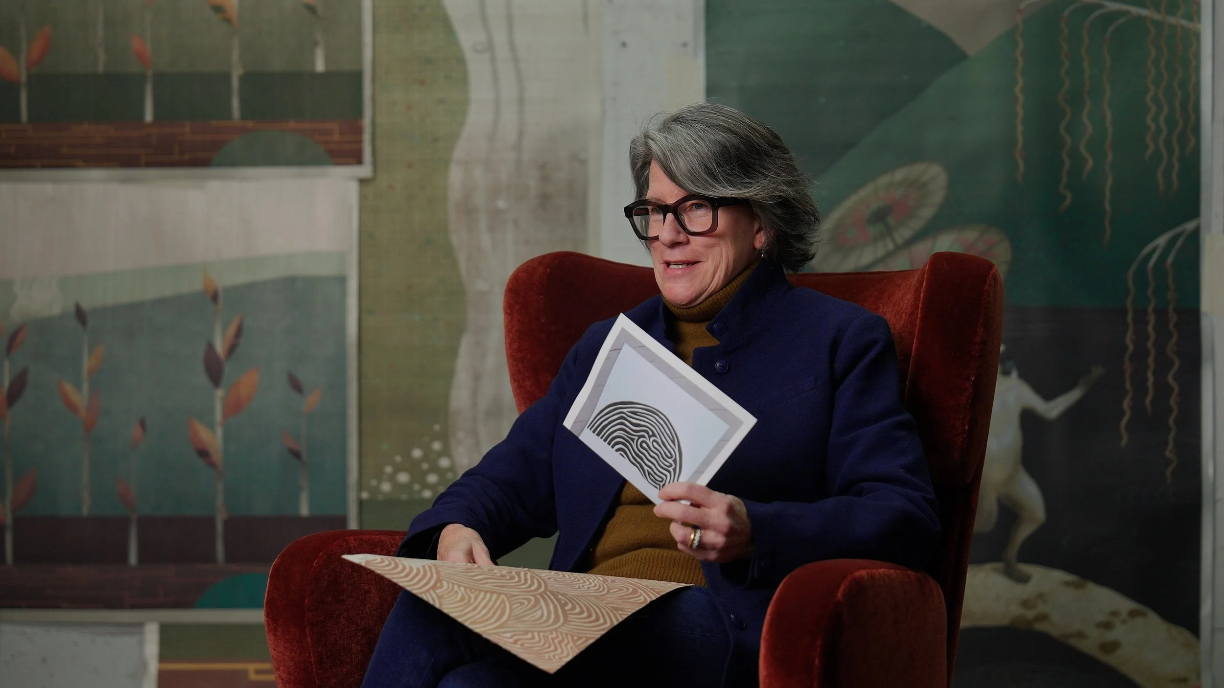
“Karen said, just paint in black on white, and send me the photographs, and then I can work with them and make them any color.”
From there, the hills got selected, layered, occasionally stretched or compressed, and printed on grass cloth, where, Eve says, the ink “feels so embedded in the surface.” The same hills also turn up, recontextualized, inside the monkey mural. It is the kind of cross-pollination that only really happens when the two people doing the work are talking constantly.
“I know a lot more now than I did when I started,” Eve says of the technical side. “I thought you could swipe old patterns from a book somewhere and end up with wallpaper, but it is not the same as what Karen’s doing. It’s nothing if not a labor of love.”
Klimt, Shagreen, and a Pewter Blue
The reference list reads like a long afternoon at the Neue Galerie. Klimt, with his gilding and jewel-like patterning. Viennese Secession. American, French, and Japanese Deco. Old gilded book covers. Deco shagreen on Ruhlmann furniture, imported, somehow, into a hill.
“That kind of transformation in thought and process is very exciting,” Eve says. “It wasn’t a race or a game, it was just exciting. What about this? What if we did this, or this little pattern? Let’s look at deco shagreen and then import that into a hill pattern.”
The colorways came last, and Eve is candid that naming them is its own peculiar discipline. “There’s a certain moment in trying to figure out names for colors and collections where I feel like there’s a little door you go through and it gets a lot easier. Before that, I was really sort of bumping my head up against it. When it’s not easy, it’s sort of torture.”
Eventually the names arrive on their own. Pewter blue, for instance, was not chosen so much as recognized.
On Collaboration
Both designers come back, again and again, to the human side of the project. Karen says her real surprise was how easily she fell into a working rhythm with someone else after years of designing alone. Eve puts it more philosophically.
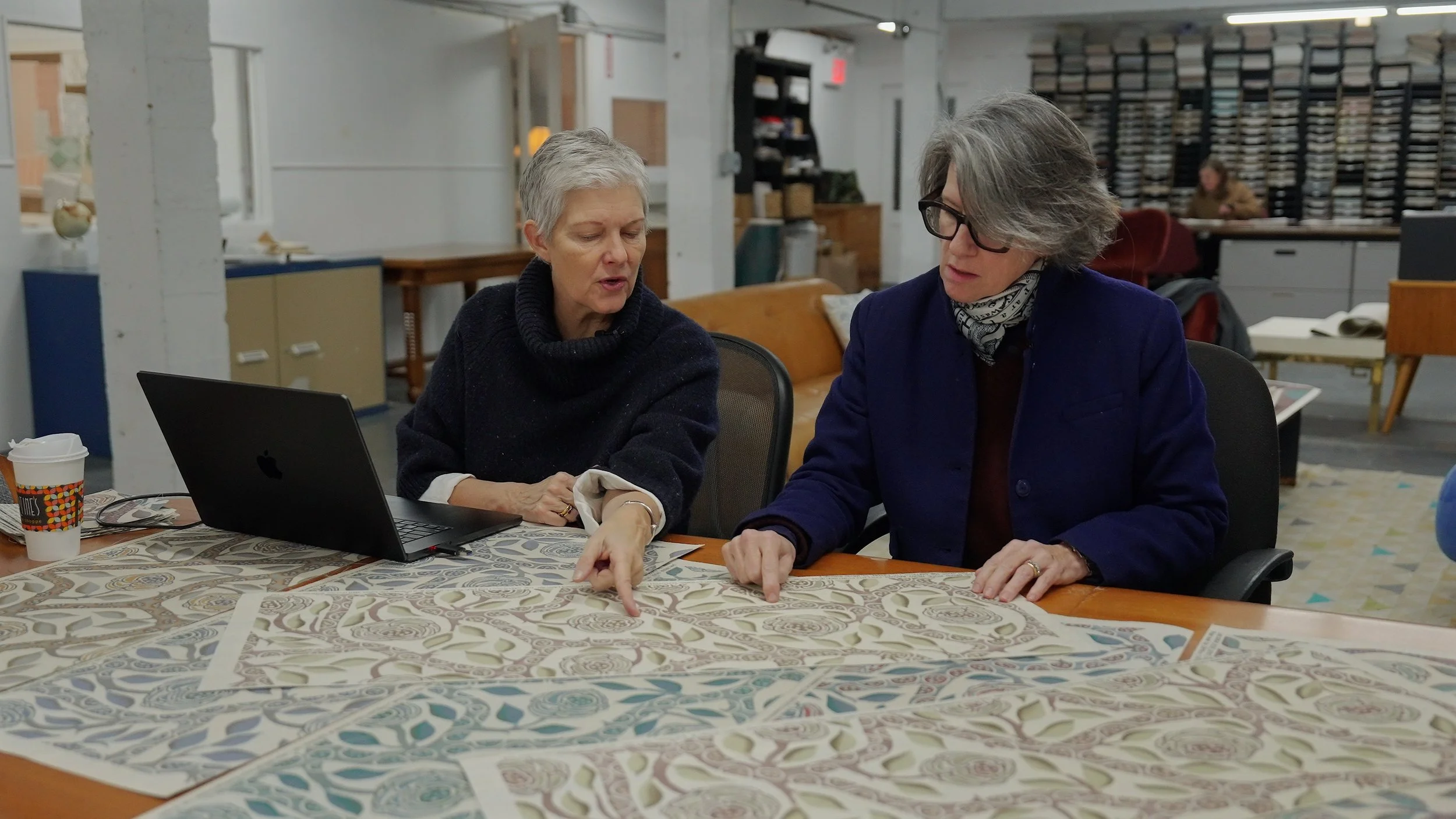
“Collaboration does great things to time. It slows time down, it speeds time up. There’s something very rich about it, and it always makes me feel like I’ve had a bigger experience than I would have had on my own.”
Asked whether she would ever have made a wallpaper collection on her own, Eve laughs. “Probably not. There’s so much to learn. You don’t just walk out of the house one day with a brand new idea, and then technically you’re all conversant and can do it. This idea of partnership fell sort of out of the sky in such a great way.”
Karen, for her part, is already thinking about the next colorway. She tends to design up until the last possible minute, then drop new patterns on her printers with three weeks to go and a holiday wedged into the timeline. “Par for the course,” she says.
A Note to Designers
If you have specified Curious Eve, or any wallcovering that took this kind of work to make, you already know the next question: how does it stay this way. Grass cloth is beautiful and unforgiving. It absorbs, it shows, it remembers every brush of a sleeve.
Fiber-Seal treats wallcoverings on the wall, in the home, after the installer leaves, and the protection is invisible. If you are working on a project where the paper deserves to be there in ten years looking the way it does today, we would be glad to come take a look.